The Problem with Arrears Notices
When I started this project, my primary contact was a developer who maintains an admin application for a local union branch. This application keeps track of dues payments and he was looking for help with redesigning it to solve an issue the administrators were having.
Members' Complaints
The developer explained that admin were getting calls from members who had received an arrears notice and were confused about when they missed their dues payments.
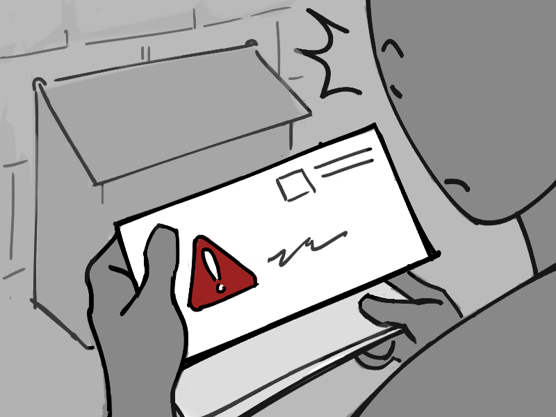
Members would receive an arrears notice, telling them they hadn’t paid their union dues.
Some would be surprised and concerned because they thought that their employer had missed a payment, so they would call the office.
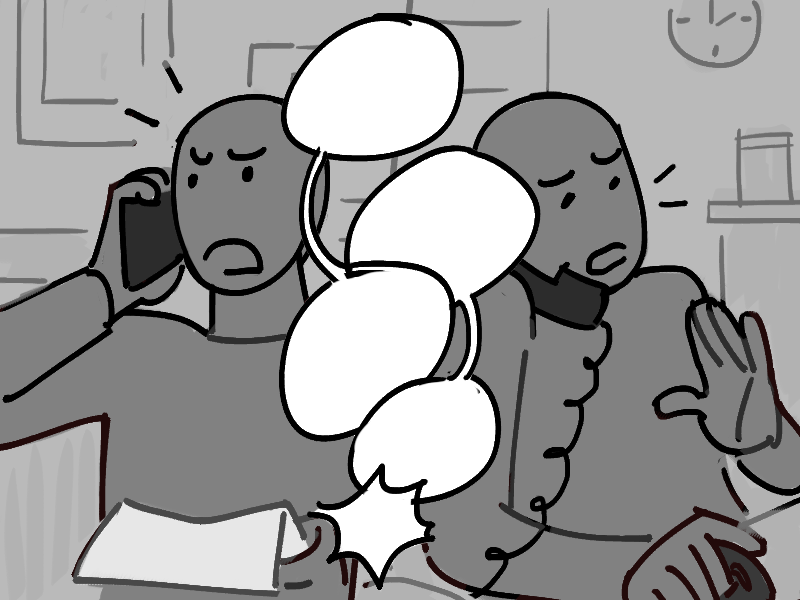
When administrators tried clarifying using the information in the application, it would often cause more confusion.
Fixing the dues application
Some union staff had suggested that they change how the payments
were recorded, so that admin could explain it more easily. But
the developer explained that these changes would require a
complete overhaul of the application.
This would take a long time, and to add to this, many of the
more experienced admin were used to how the application worked
and would have to learn a new system.
Reduce member complaints
Simpler to understand
Costly implementation
Admin have to learn a new system
This left them with the question:
If it wasn’t feasible to completely change the application, how else could they alleviate confusion about members’ dues payments?
Finding the Miscommunication
Before I started exploring solutions, I wanted to really understand why members were calling the office.
My first question was...
What did the arrears notice tell members?

If members still had outstanding payments after a certain amount of time, they would be sent an arrears notice that looks something like this:

From this notice, you might assume that you owed $43.00 from a
missed payment for December 2025.
However, this was not always true—it could be the case that
the missed payment was from a different month.
This led me to ask...
How did the dues application keep track of payments?

In order to understand how the date on the arrears notice could be “wrong”, we have to understand how the admin application keeps track of dues payments:
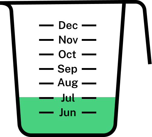
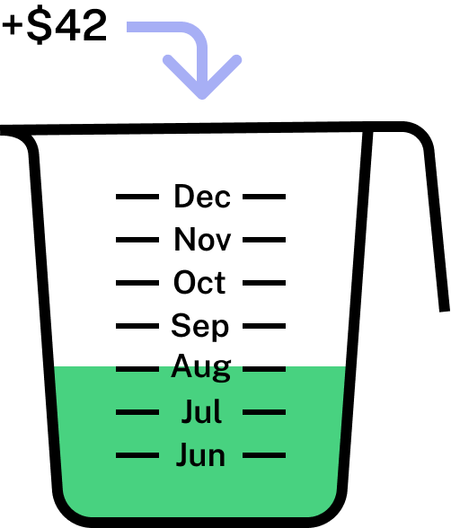
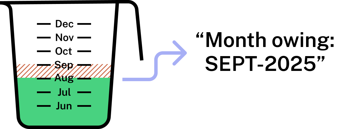
So when we look at the example arrears notice it could be that the member missed their December payment or it could be a scenario like this:
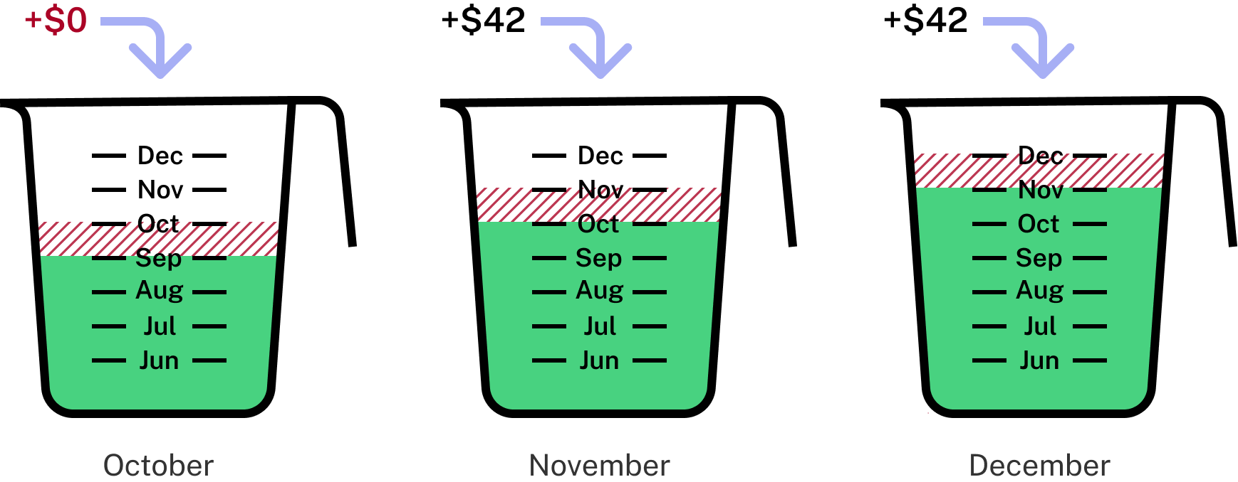
Month owing: DEC-2025
This made sense to the admin because they had the complete records which showed when the payment was made, who it was made by, how much was paid, etc. But since the members were only given the period of the missing payment, they had to fill in the gaps themselves.
This made me think...
Was there any other way for members to check their dues payments?

I asked the developer if there were any other sources of
information that members could access before calling the
office. He said there was one other option:
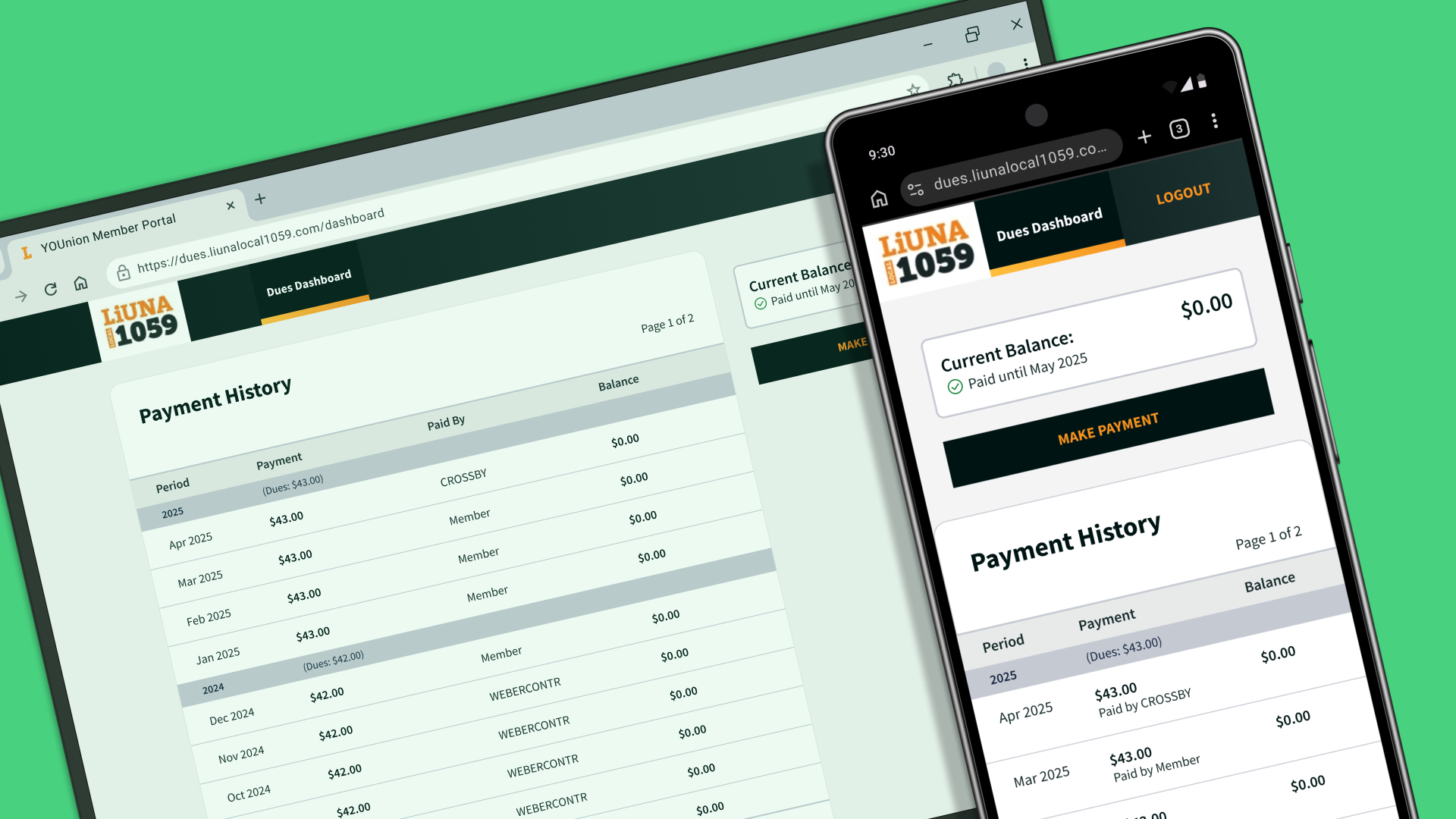
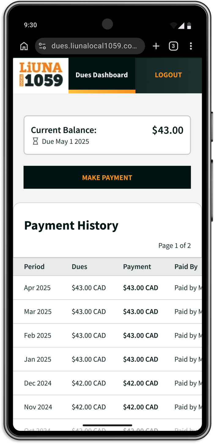
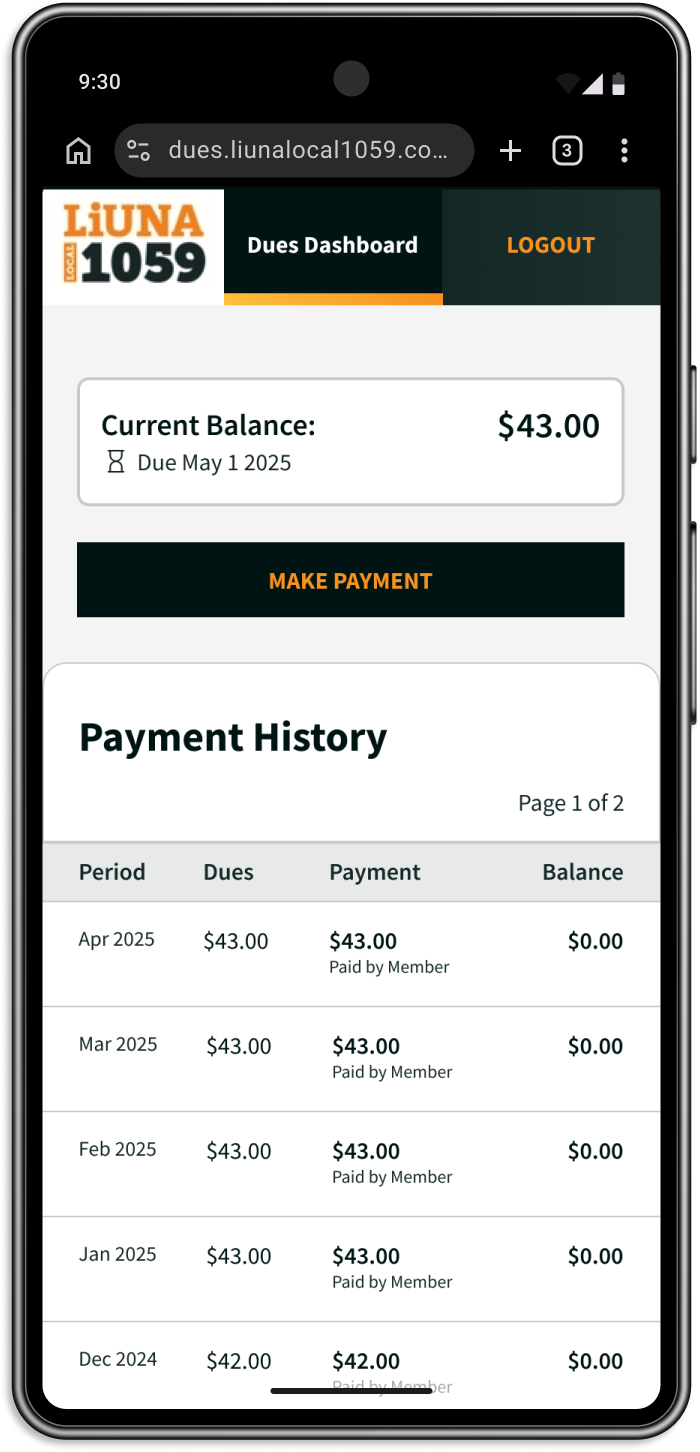
The dues dashboard on the member's portal
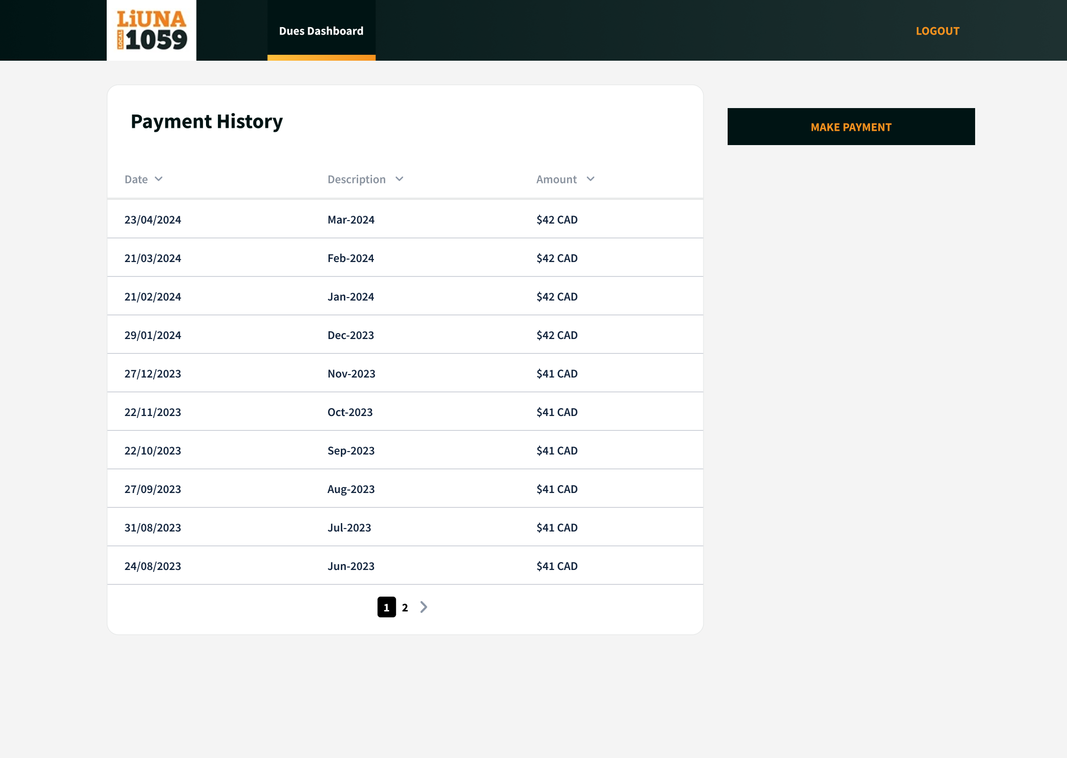
This page showed their payment history, but as you can see, this could be hard to read and didn’t provide information on who was responsible for the missed payment.
So why were members calling the office?
Due to the unintuitive way the system categorized dues payments, the arrears notice and dues dashboard didn’t provide enough information to clear up their concerns. The only way to get this information was to call the office.
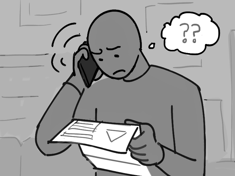
- Receives their arrears notice
- Checks their dues dashboard to find the missed payment
- Calls the office to ask admin
“I’m missing a payment in December? But my employer should have paid this month!”
“This just says the same thing! I still can’t tell if my employer paid...”
Bridging the Gap
The thing was, all the information was in the system—what payments were being missed, who was responsible for them—it just wasn’t being shown to the members.
I suggested that they could alleviate members’ confusion by updating the dues dashboard with better information.
With the information readily available, members wouldn’t have to call the office in the first place.
Receives their arrears notice
Checks their dues dashboard to find the missed payment
“Oh I see... I missed a payment while I was between jobs"
Understands their outstanding dues
Targeting the dues dashboard instead of the dues application would eliminate the need for costly changes and keep the system that the administrators knew best.
Redesigning the Payment Page
Working within a limited budget, I focused on how I could make
things clearer using content and styling.
I avoided making major changes or adding complicated
new features that would slow down implementation. At this stage,
it was important to work closely with the developer to understand
the technical limitations of what data could be displayed and how
we could format it.
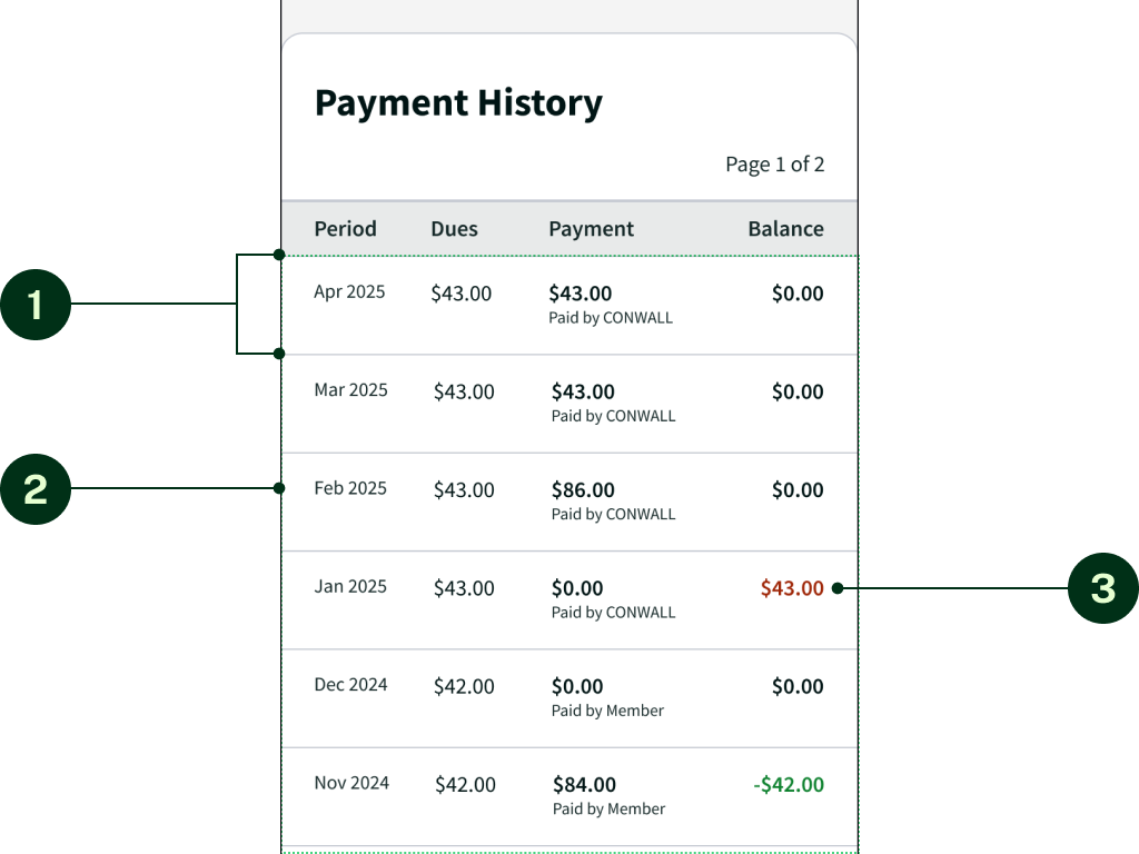
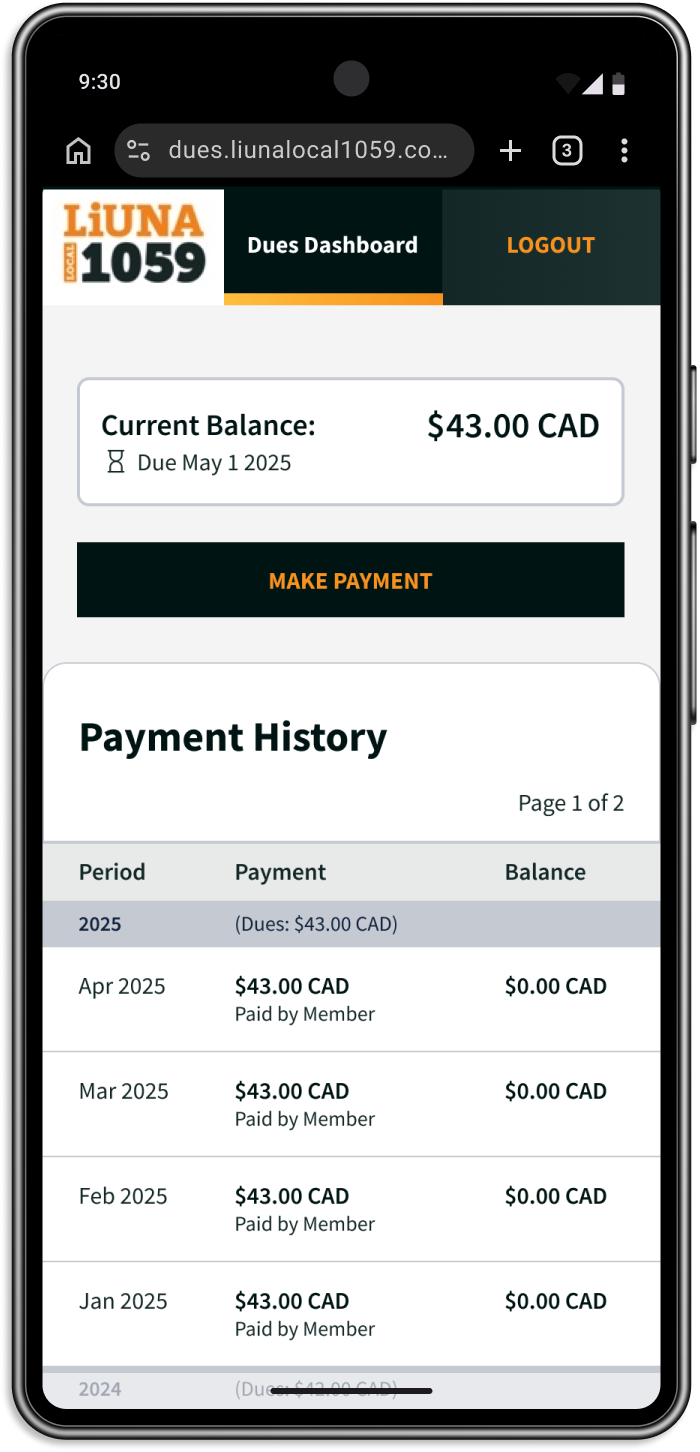
To start, I reevaluated what data the table should show:
Previous Version
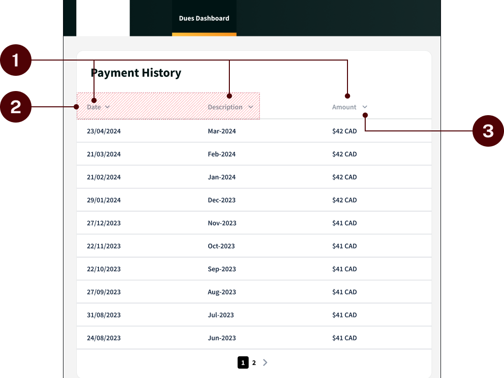
In the previous version, the table displaying the payment history was unclear & lacked crucial information.
- Names of columns were vague and didn’t describe their content well.
- “Date” and “Description” fields seemed redundant.
- Sorting by “Description” and “Amount” wasn’t helpful to members.
Updated Version
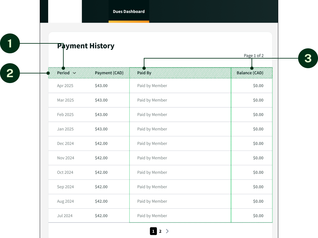
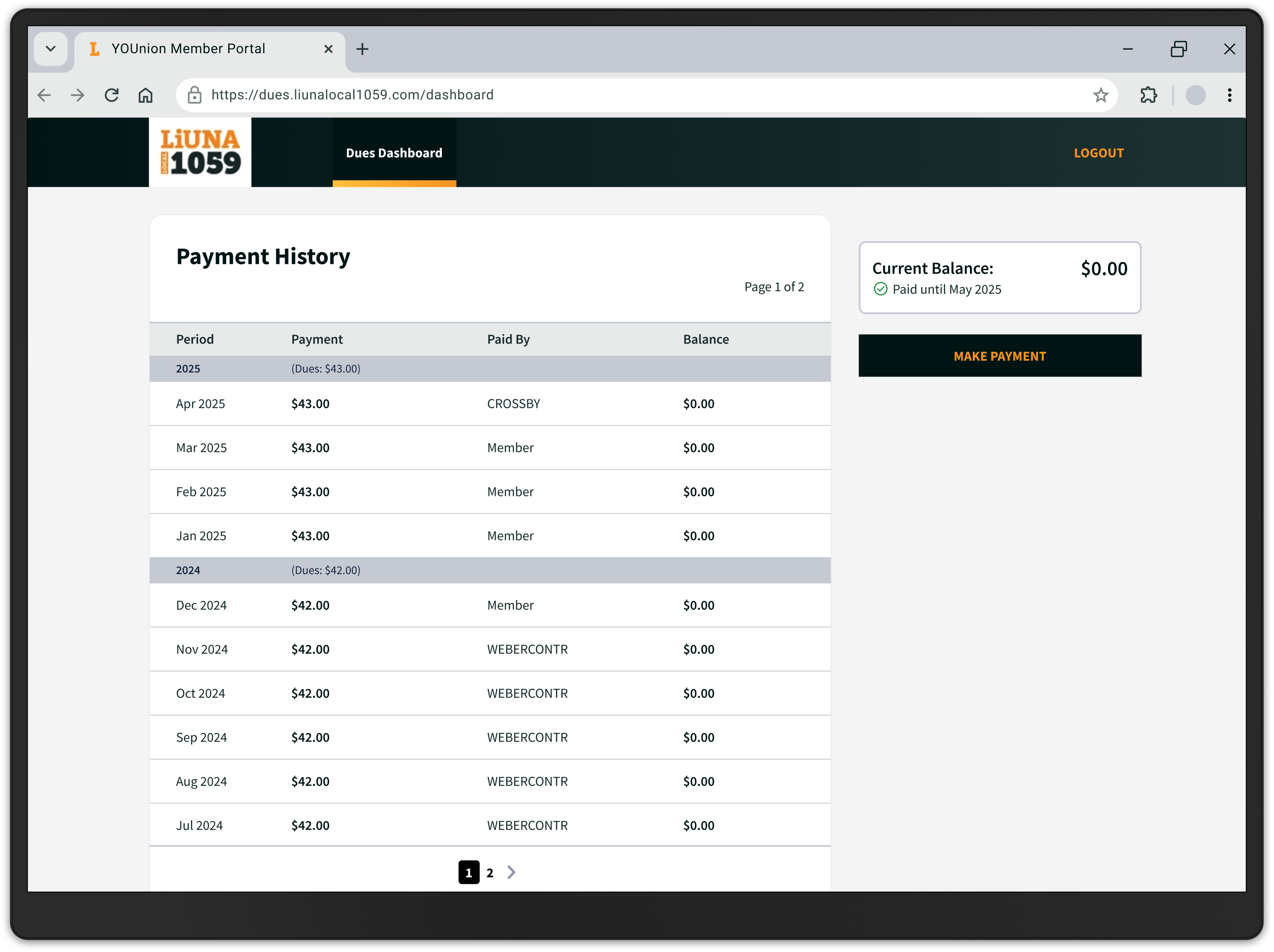
To provide members with the complete picture of their payment history, columns could be renamed and more data could be added.
- Combined “Date” and “Description” into “Period”.
- Renamed fields for better clarity.
- Added columns for who made the payment and what the total balance was that month.
- Removed sorting features.
Next was the overall lack of readability.
Previous Version
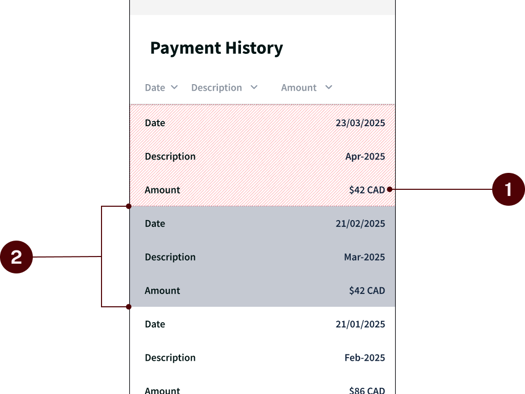
A lack of visual hierarchy made it difficult to find what you were looking for, and there were some challenges with the responsive design on mobile devices.
- Similar text formatting made it harder to read.
- On mobile, the stacking of the rows made it awkward to read and scroll through.
Updated Version
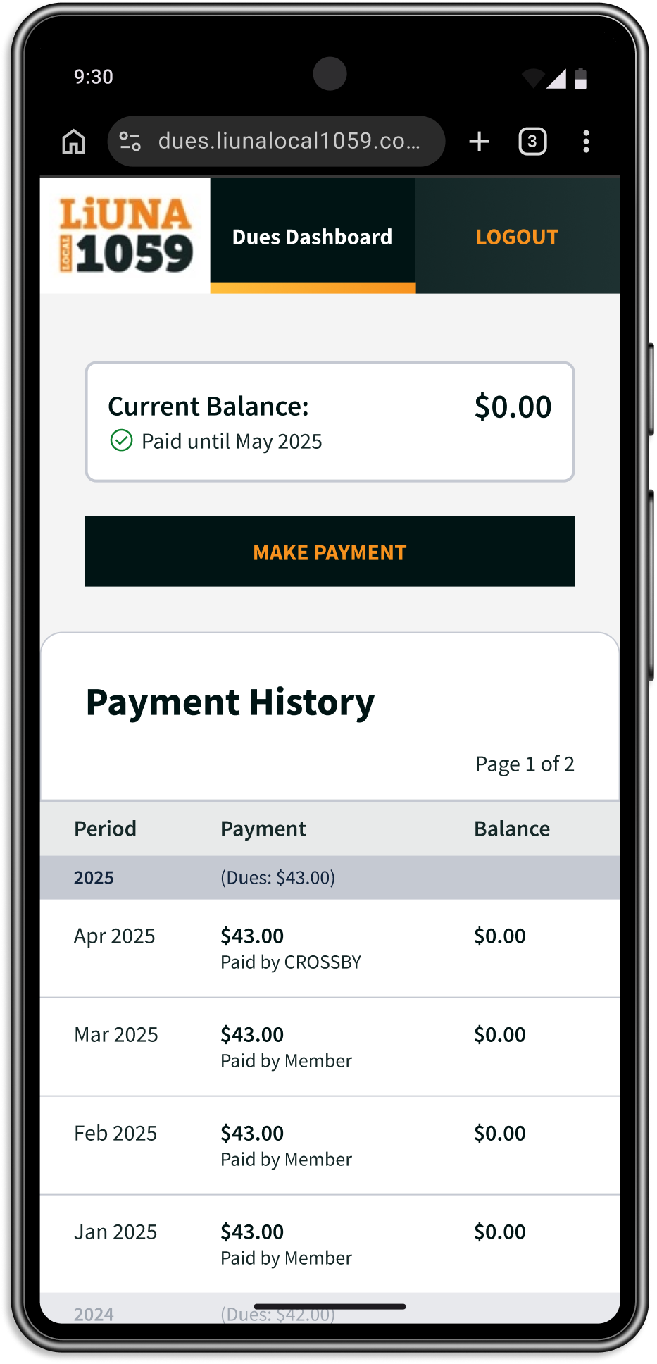
To improve readability, I thought it would be best to preserve the table formatting on mobile. Further styling could be used to make important information stand out.
- Changed the text size and font weight of certain columns to create emphasis
- Colour-coded the “Balance” to show which periods the member was owing or had credit.
The final priority was to provide members as much clarity as possible about their account status.
Previous Version
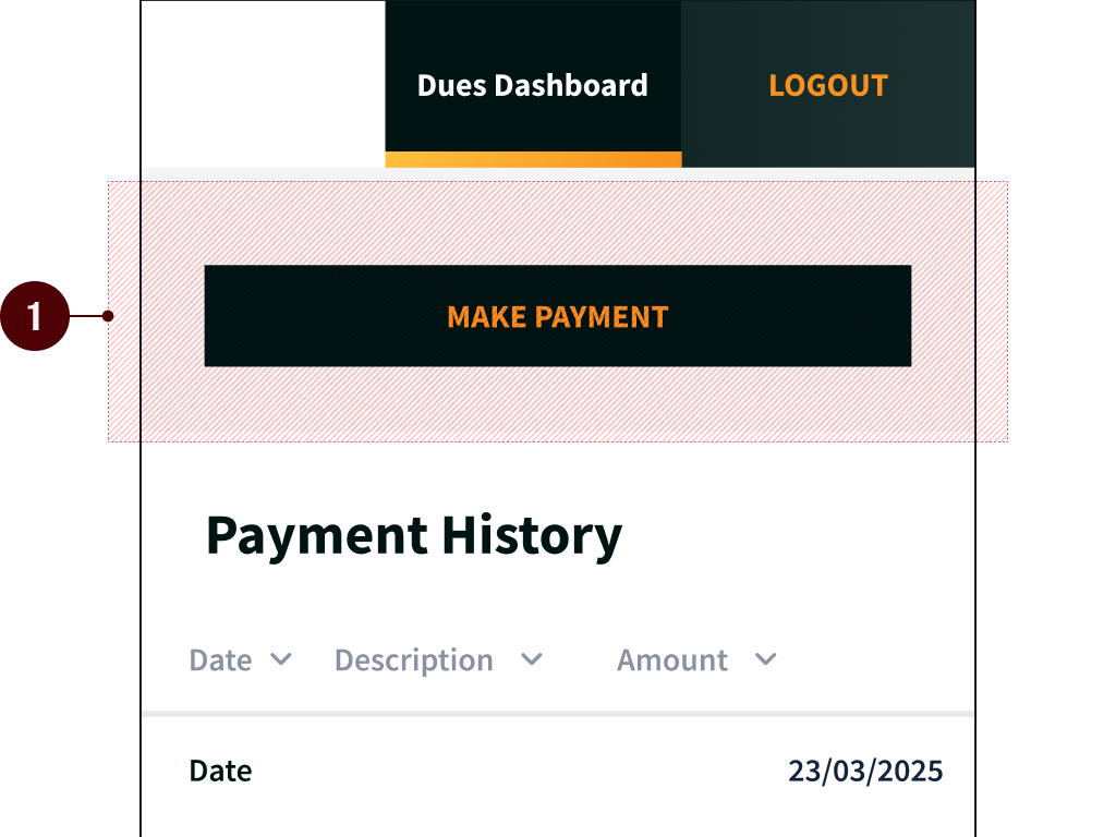
When a member opened the dues dashboard, there was no summary of their account or overall balance.
- Payment button shown, but no information on the status of their account.
Updated Version
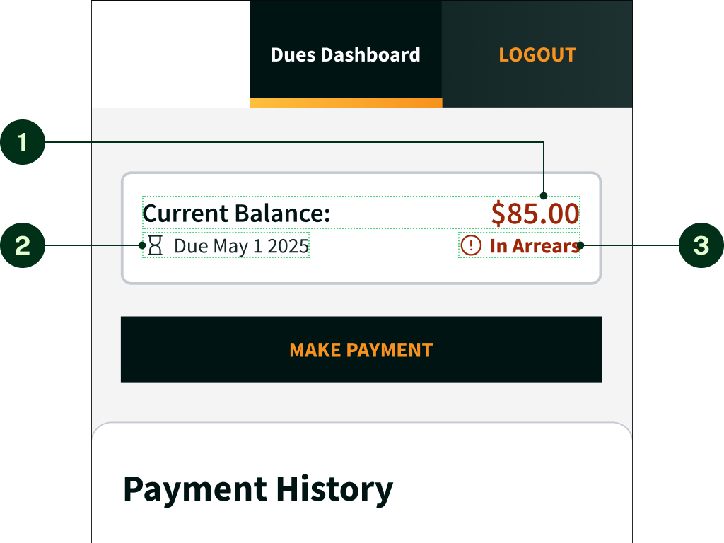
To make the experience as seamless as possible, a summary could be added to allow members to see their account status at a glance.
- Displayed the member’s current balance.
- Displayed the upcoming due date.
- Displayed the status of the account.
I put together three different versions of the dues dashboard, showing different desktop/mobile layout at different levels of effort of implementation.
Concept 1
Scrollable Table
Concept 2
Condensed Table
Concept 3
Condensed With Break
Introducing the New Design
In the end, the team agreed to proceed with Concept 3.
Since hand-off, the new payment history page has been implemented
and is now being used by members.
So far, responses have
been positive and according to the office staff, calls have reduced.